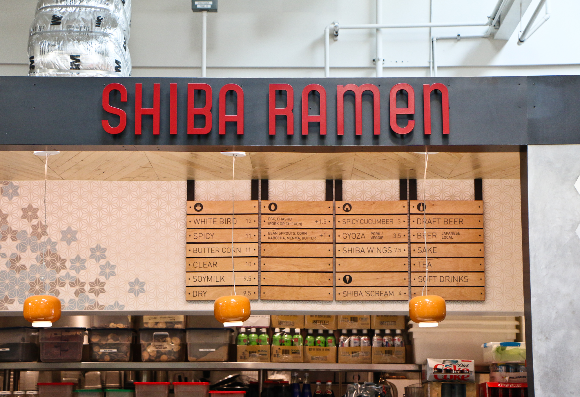
Ramen Chemistry is more than a little behind in addressing what's supposed to be its main theme: building a restaurant business. So let's do some catch-up; there's a lot to talk about. The main event this fall has been the design and construction of Shiba Ramen's new Oakland location. At the end of August, we leased an 1800-sf space previously occupied by Bittersweet Cafe, at 14th and Broadway, next to City Center BART and Oaklandish, and across from Oakland City Hall.
Shiba Oakland is a major renovation. We started demolition around Labor Day and the project has gone forward in stop-and-go fashion since then. The reason is that it's getting designed while it gets built. This isn't like our Emeryville location, where the design and architecture were all packaged and permitted before we started construction. Here we were able to do certain things without permits, but we still had to put together a full set of construction drawings for the building and health departments before other things could move forward. And those drawings couldn't get done until we figured out both what we wanted the space to look like, and how we wanted it to function.
Design for Function
Kitchen
Our top priority was to outfit the kitchen to enable us to do basic production (soup, oils, tare, meats) for both Shiba Ramen locations. Labor is by far our biggest expense--ramen being very labor-intensive--and it's critical that we can tie our expansion to increased economies of scale. So we chose a location that had a relatively oversize kitchen. The dining room isn't quite as big as we'd like, but the kitchen and overall location were worth the trade-off. There's also a mezzanine level for storage, which is a huge bonus.
The kitchen we've designed to do the same service tasks and volume as our Emeryville location, but we're adding prep space and installing a 60-gallon tilting floor kettle for large-scale soup prep. We're also putting in a sizable walk-in fridge and upgrading the mezzanine to operate as a health-permitted storage area. Getting health approval for mezzanine dry storage was key, because you're required to have a certain number of linear feet of dry storage. Fitting the entire requirement in the kitchen would have killed our available refrigeration space.
Dining Room and Bar
Because the dining room is on the small side, we've designed it to maximize seating efficiency (i.e., to minimize the ability of singles/small groups to occupy more seats than they're actually using). The room long and narrow. We managed to push all the food prep into the kitchen (not always the case with ramen shops), allowing us to draw in the service counter and bar and put in as much table seating as possible. Along the left side, the room features an array of large windows onto the building's vintage early-20th century lobby. We're doing a banquette along the windows, with movable two-top tables for flexible seating.
In the remainder of the space, we decided to experiment with seating types, to create a range of experiences for customers. On the immediate right of the entrance will be a wall-facing high counter, good for singles and people on the go. Moving into the space, we will install a large communal table, seating at least 12. There is one of these in front of our Public Market kiosk, and we've found it quite useful. The bar itself is in the back of the space, and will have seating for 5. Finally, because the narrow space has to meet certain accessibility requirements, we're precluded from installing more tables down the middle. Instead, we are installing a pair of thin high counter tables bisecting the room. These can be used for having a drink, waiting for an order, or even eating ramen standing, Japanese style. I'm interested to see how these work out in practice.
We were in Tokyo last week and ate at an Ippudo (coming to Berkeley soon, so I hear) and they had a very similar seating setup--banquettes on one side, high communal table in the middle, and bar seating on the other, plus a few seats at the formal bar.
Space Design
Shiba Oakland is our first chance to design a full restaurant space. Our Emeryville kiosk offered few degrees of freedom when it came to the design. Although we were happy with the outcome, there was a lot more we wanted to do. So our message to the design team for Oakland was to take the Emeryville design to its logical conclusion. That is, take the elements we used in Emeryville and expand on them, rather than coming up with an entirely new design theme.
Tile
The signature design element in Emeryville is the geometric asanoha tile mosaic on the drop ceiling above our counter. We've also used the Japanese asanoha pattern as a brand identifier on our website, menu, and other collateral. So we opted to use the same asanoha tile in Oakland. The difference is that surface area is greater, and we'll use a new mosaic with more and deeper colors. The mosaic will be along the back bar at eye level.
We saw another opportunity to experiment with geometric tile in the bathroom. We chose a parallelogram-shaped Spanish tile, in three tones, arrayed as repeating hexagons. The result is a mosaic of different forms, like Escher-like 3-D cubes and six-pointed stars, that resonate with the asanoha pattern.
Wood
In Emeryville, we have a wood soffit over the counter that wraps down the wall next to the POS. The soffit is made of intersecting triangular units, with a small 3-D undulation along the length of the structure. If we had the soffit to do over again, we'd make the undulation more pronounced. This time, we have a lot of overhead space, both lengthwise and vertically.
The designers came up with a really cool slatted wood soffit that runs along the lower ceiling over the bar and then projects upward at an angle toward the high dining room ceiling. The soffit is composed of five parallel strips of differing widths, each of which has a slightly different 3-D shape. You can see what I mean in the image below. We're also using wood in vertical slats under the bar counter and POS.
Lights
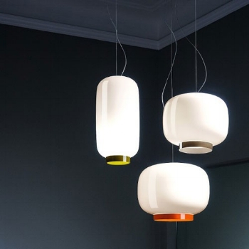
This is something we spent an undue amount of time on this fall. We need pendant lights over the bar, and along the dining room walls. We also wanted to use a dramatic chandelier over the entry. Over the bar, we've decided to continue the Japanese-inspired look used in Emeryville. In that application, we used Foscarini "Chouchin Mini" lights, reminiscent of a traditional paper lamp. Here we're going to use the "Reverse Chouchin" by the same designer. It's the same shape, but a much larger 12' diameter, and white/gray instead of orange/white. Should look good against the blue/gray/white/yellow asanoha mosaic behind the bar.
For the chandelier, we debated some amazing options, but struggled to find something that hit the right size/design/cost balance for the project. These things always end up being more fraught than you expect when you really set down to evaluate options. There are a million of them, and most just don't work for one reason or another. Anyway, I'm excited about what we chose--the "Coral" pendant by David Trubridge. It's a 4-foot diameter sphere with a central light source and a painted bamboo shell covered with geometric openings. The entire thing ships in a small box with ~60 identical pieces that get assembled on-site.
Construction Status
Things are looking good over there at Shiba Oakland. The health department has approved the plans, and they're at the building department now for review that will hopefully be done before the holidays. A permit isn't actually needed for most of what we're doing, so work is and has been proceeding apace.
At this point, the bathroom is 98% complete. Just need to install a couple fixtures and do some touch-ups. The kitchen is completely gutted of equipment and fixtures, and is now getting limited plumbing and electrical upgrades to get ready for the new equipment (which has been ordered and will arrive in January). We've built up the half wall between the hallway and kitchen to create a housing for the walk-in fridge. The mezzanine area just got tiled and new lighting installed, and is nearly complete for the storage area.
The entire hall and dining room have been tiled, and the walls repaired and painted with neutral colors throughout (accent walls still tbd). The bar die wall and back bar framing are in and ready for quartz countertop and wood slat installation. We're about to finalize the design for the back bar tile mosaic, and then we'll assemble it at our house later this month. Installation will be quick. They're starting to get the tables and dining counters fabricated.
We're now working out the details for signage and window treatments, so those things can be fabricated last. The goal is still to get open in late January, at least on a limited basis. This has been a big project, and let me tell you something. We're ready to get on with the ramen (and, obviously, beer, wings and sake)!
p.s. If you're curious, we're working with LMNOP Design on the design-build portion, and Michael Scheiman of Myers Restaurant Supply for the kitchen design and equipment.


