Our logo concept was this. The logo should feature a shiba inu. The shiba either should be some sleek and abstract rendering, or an animation-style character image. It shouldn't be too literal, but it also should be restrained; nothing too loud, nothing too cute. It should evoke Japan without going over the top with a classic Japanese design aesthetic. It could be based on a Japanese family crest, a mon, or on an approach like those taken (to successful visual effect) by Starbucks and Chipotle: concentric circles with an icon in the center and the name surrounding. It should be a color that is bold but balanced, probably a variation on red, and it should be near-monotone. It should strive to be eye-catching and memorable. It should be capable of becoming iconic.
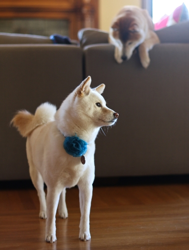
What a tail.
That, more or less, and over the course of several hours, was what we explained to our designer, Misa Grannis, when we met her in person for the first time. We invited Misa over for dinner so we could get to know each other, and so we could explain to her who we are, where we're coming from, and what our motivations and goals are for Shiba Ramen. Our view is that the better we all understand each other from the outset, the better we can work together toward the common goal. Meeting our shibas here in their native habitat is also a pretty important part of the background.
When Misa showed up carrying her personal copy of a book of Japanese mon seals, it confirmed our expectations that she would understand exactly what this project is trying to accomplish. Also, did I mention that her actual initials are MSG? Perfect person for the project.
Round One
Misa took our guidance, went away for a few weeks, and then returned with a collection of prototypes. She showed us a few dozen ideas in a sort of brainstorming exercise, the goal of which was to come to terms on the direction we wanted the project to take.
One concept we liked was a shiba face, rounded in a circle, and bisected so that the bottom half was also a bowl of ramen. This concept represented both the shiba and the ramen, and it was pretty streamlined. It was cute, but not too much so. The second was Misa's attempt to infuse a shiba into the mitsudomoe mon. And the third featured an S-shape meant to suggest the flourish of the shiba's distinctive tail. We decided not to pursue concepts that appeared too traditional.
Brainstorming. We considered a lot of concepts, but only pursued the three in the middle row and the one at lower left. We asked Misa to try to hit a middle ground between the two mon concepts for the next round. The others we didn't pursue for either being too suggestive of ramen, dogs, or traditional Japanese style.
Round Two
Misa came back two weeks later with a set of refinements. She'd honed the shiba/bowl concept and the S-shape, and had made a dramatic improvement to the mon, which now featured a sharp design abstracting the shiba tail and ears. But she also brought a bold new design using a stylized shiba silhouette set in a surrounding square.
We were pretty excited about this new contender, and asked Misa to do some small refinements. We also asked her to try a few text and color variations on the shiba/bowl. We thought the mon was in good shape for the time being. We decided the S-shape, while simple and elegant, just wasn't the distinctive look we were going for. The objective was now to refine the shiba/bowl and the silhouette square, then evaluate them side-by-side with the mon.
Refinements. Plus one standout new concept.
Non-Scientific Focus Group Exercise/Extended Rumination/Decision
Once Misa came back with her further refinements, we started taking an informal poll of friends and coworkers. I showed the three concepts to 40-50 people and asked their opinion; I know that Misa and Hiroko also did some polling. About 45% liked the shiba/bowl and 45% chose the silhouette. 10% or less picked the mon; most suggesting that it was too abstract and not really connecting with it. I happen to like the mon, but I agree it doesn't resonate like the others. We set it aside pretty quickly (although I would love to use it on a t-shirt at the store).
It was down to shiba/bowl and the silhouette. The shiba/bowl had been the initial frontrunner, but a significant minority of people thought it was a cat, given the shape of the ears, the roundness of the face, and the chopsticks being suggestive of whiskers. It turned out that this was a hard problem to resolve, especially because the roundness of the ramen bowl limited our ability to narrow the face.
Finalists. Mon (right) is struck first. Then shiba/bowl goes, doomed perhaps by being too catlike. Silhouette in the center strikes the right balance. We have a winner!
But just by letting some time pass, it was easy to make up our minds. Upon reflection, the silhouette was hands-down the best overall design, and it fit most closely with our ideal. The silhouette was the clear choice for Shiba Ramen.
Next time, I'll tell you about our final logo task: picking the right Japanese text. But I'll do it by explaining the different types of characters used in written Japanese (it's not just a simple alphabet) and the different design options they create.


