Shiba Ramen Has a Space! Emeryville Public Market

Big News this week for Shiba Ramen!  After six months of hard work, we closed a deal to open later this year in Emeryville's redeveloped Public Market.  We'll be part of a newly renovated international food hall, featuring a ton of new and diverse food concepts.  There will be around 15 new food kiosks, a few vendors housed in outfitted shipping containers, and a couple of anchor restaurants.  There are a few pre-existing tenants (Urban Outfitters, Guitar Center, Peet's, Hot Italian).  Long-term plans for the project include expansive new retail and residential space.  

There is a serious unmet need that the Public Market is going to fill.  Emeryville has tons of retail (Ikea! Home Depot!), corporate offices, and multifamily residential.  But there's practically nothing to eat there, setting aside a few chain restaurants and Swedish meatballs.  I think this place is going to have a lot of energy, so it's a good launching pad for Shiba Ramen.  And, I'm happy to say, the Public Market's kiosk model fits nicely with our no-tipping policy.  


Right now, we're in the midst of the design and architectural process for our space.  Then we're off to permitting and on the hunt for general contractors.  We'll be doing our buildout later this summer.  I'll write all about the process here at Ramen Chemistry.  Here and here are links to press reports of our joining the Public Market, and here and here are reports about the Public Market project.  

Ramen Chemistry's Japan Diary: The Ramen Scene

Our flight took off from Narita an hour ago. Ramen Chemistry is heading back to Oakland after six nonstop days of Japan. Seven ramen restaurants, thirteen different ramens tasted, two sushi dinners, one sushi breakfast, and plenty of culinary exotica consumed, the most foreign—and the most delicious—being shirako soft roe, sacks of fish sperm (shirako means “white children”) in ponzu sauce. Copious amounts of beer and sake were downed in the process. And we had breakfast at Denny’s not once, but twice—twice more than I’ve eaten at an American Denny’s in the past 30 years.

Tokyo Scene.  Hama-rikyu Gardens, a former preserve of the Tokugawa Shoguns, backed by the high-rises of Shimbashi.  

Tokyo Scene.  Hama-rikyu Gardens, a former preserve of the Tokugawa Shoguns, backed by the high-rises of Shimbashi.  

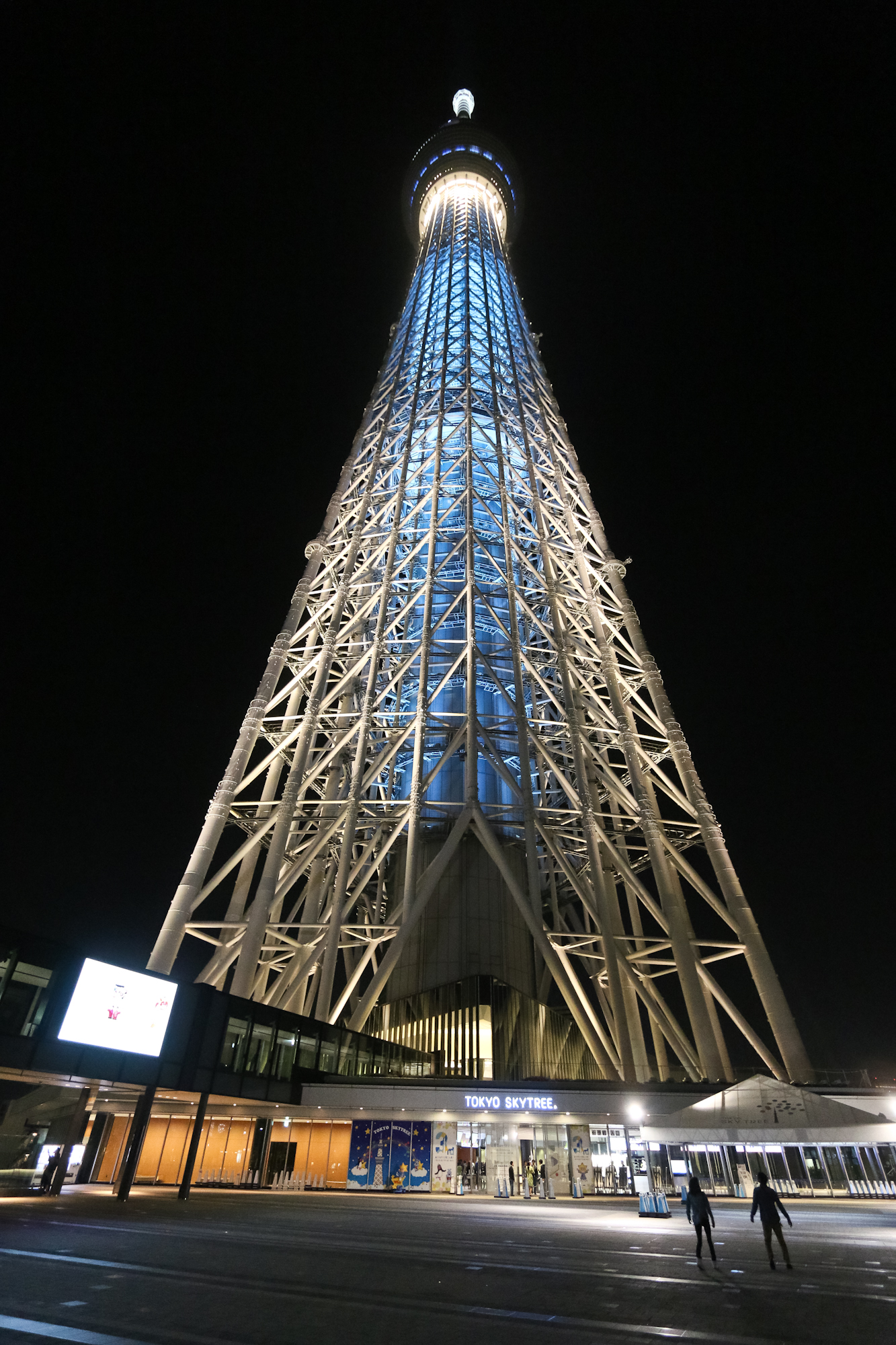
Along the way, we toured Hiroko’s ramen school and interviewed both the owner and a current student, a former Nissan engineer who is set to open his first ramen restaurant in Chennai, India later this year. We ate at the restaurant of a renowned ramen chef (and one of Hiroko’s ramen senseis), Keiichi Machida, and interviewed him about his life in the ramen world. We walked mile after mile through Tokyo, passing through gardens and shrines, visiting the fabulous Sky Tree, and finding ourselves in the parallel (and fucking amazing) universes of an owl café and a maid café. We finished with a trip to Hiroko’s hometown, where her parents live in a traditional Japanese house—tatami floors, shoji screens, and no furniture—farm their own vegetables, make their own charcoal and salt, and (to our great fortune) catch their own oysters. We took about a thousand pictures.

Ramen chemistry clearly has a lot to talk about. Ramen chemistry also has a day job that starts again in about 30 hours, so let’s see what we can accomplish on this flight before we become delirious. Naturally, we’ll start with ramen.

Tokyo Owl Cafe. Magical experience.

Tokyo Owl Cafe. Magical experience.

Ramen in Japan

The Japanese eat a lot of ramen. A lot of ramen. There are estimated to be between 30,000 and 40,000 ramen restaurants in Japan. More than once on this very short trip, we encountered a “ramen street” where every shop sells ramen. When we asked a Japanese friend how often she eats ramen, her response spoke volumes about the local baseline. “Not much,” she said, “only about every two weeks.” Compared to this, ramen in America is little more than a culinary parvenu, a novelty item.

That’s rapidly changing, of course, but the reality is that the clusters of ramen restaurants in the Bay Area, NY, and LA—places that have something of an established ramen scene—and the rarefied smattering in the American interior are nowhere near the critical mass in Japan. So while I’ve often thought that San Mateo, CA has a ton of ramen restaurants (there were around five when I lived there a few years ago) compared with my hometown Akron, OH (there are unequivocally zero), San Mateo’s total is only half of that in the underground mall at Tokyo Station. This is all to say that there’s context here: ramen may be hot and trendy in America; in Japan it’s an ingrained part of life.

Tokyo Station "Ramen Street."  Restaurant choices (left). Ramen ticket machine (right). This is how you pay at most ramen shops in Japan: pay the machine, get a ticket, hand it to the restaurant staff.  The ramen comes to your table. &nbsp…

Tokyo Station "Ramen Street."  Restaurant choices (left). Ramen ticket machine (right). This is how you pay at most ramen shops in Japan: pay the machine, get a ticket, hand it to the restaurant staff.  The ramen comes to your table.  You eat it, then walk out when you're done.  

The sheer scale of the ramen industry in Japan and the sheer volume of competition, drive market dynamics in a pretty interesting way. There’s around 10% yearly turnover in the industry. That’s around 3000+ ramen restaurants closing, and 3000+ new ones taking their place. Every year! In the U.S., a ramen shop can often distinguish itself merely by existing. In Japan, more is most definitely required. The outrageous quantity of ramen eaten in Japan gives rise to a commensurate level of ramen sophistication in Japanese ramen consumers.

One consequence is that Japanese ramen restaurants often distinguish themselves by focusing on a single type of ramen, or a single dominant flavor profile. We went to one restaurant that specializes in clam ramen, one that specializes in spicy ramens with over-the-top use of high-flavor additives like bonito powder, and one that sells 1500 bowls a day of Yokohama iekei-style ramen (tonkotsu shoyu)—there is literally one item on the menu. On the other hand, there are plenty of chain-style places that serve a wide variety of styles.

The Ramen Scene.  Keiichi Machida's Kyouka in Tachikawa.

The Ramen Scene.  Keiichi Machida's Kyouka in Tachikawa.

Another consequence of having such a well-developed and massive industry is that large-scale trends come and go over time. At one time in the 20th Century, ramen trends tended to focus on regional styles, i.e., Sapporo miso or Kyushu tonkotsu.  Machida-sensei explained to us that when he started in the industry 15 years ago, ramen trends were driven by the Japanese media’s fascination with—and focus on—celebrity ramen chefs. In subsequent years, thick and rich ramens boomed, but that trend gave way to lighter styles as the costs of ingredients increased (thicker = more bones = more $$). Today, trends favor more minimalist ramens, with tastes that are more unique and individualized.

The point here is that ramen in Japan is as diverse as it is ubiquitous. We went to seven restaurants and had seven very different experiences, and we hardly scratched the surface.

In coming posts, I’ll tell you all about the ramen we ate and the ramen people we met, with lots of pictures. Don’t worry, though, we’ll stop by a maid café soon enough.

Japan Design Photography

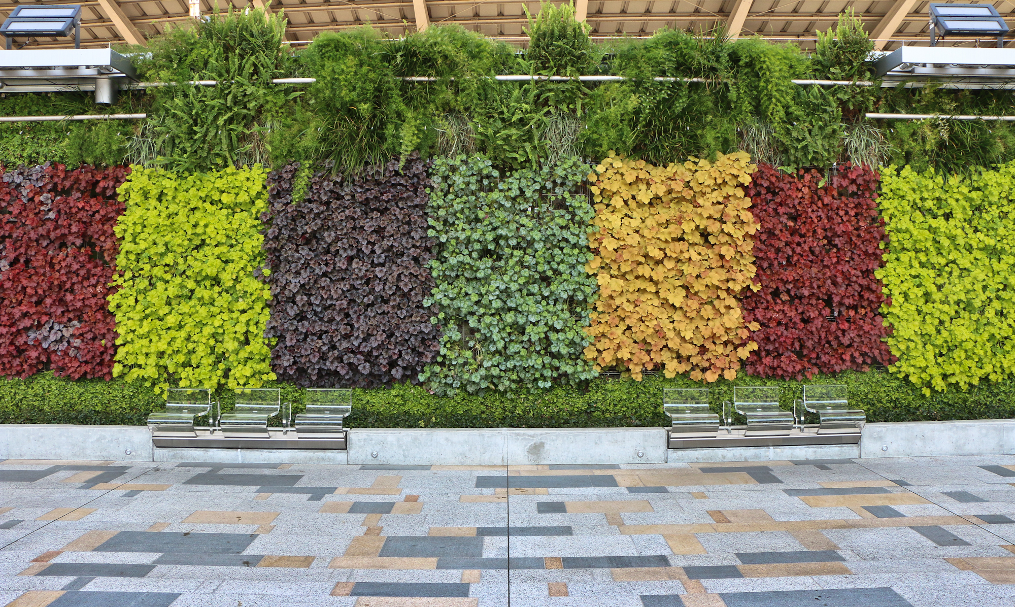
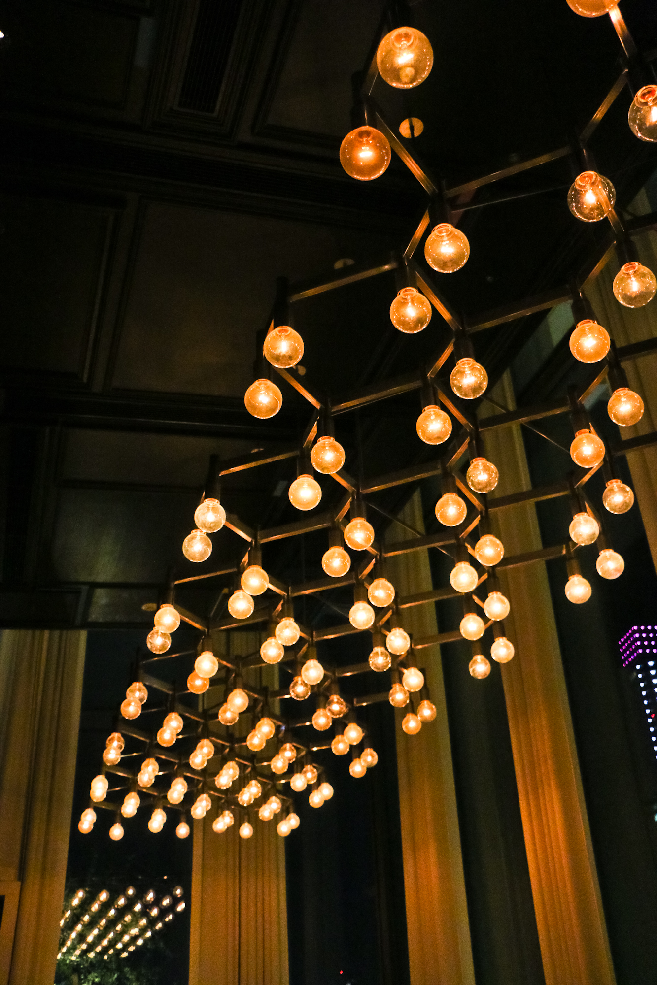
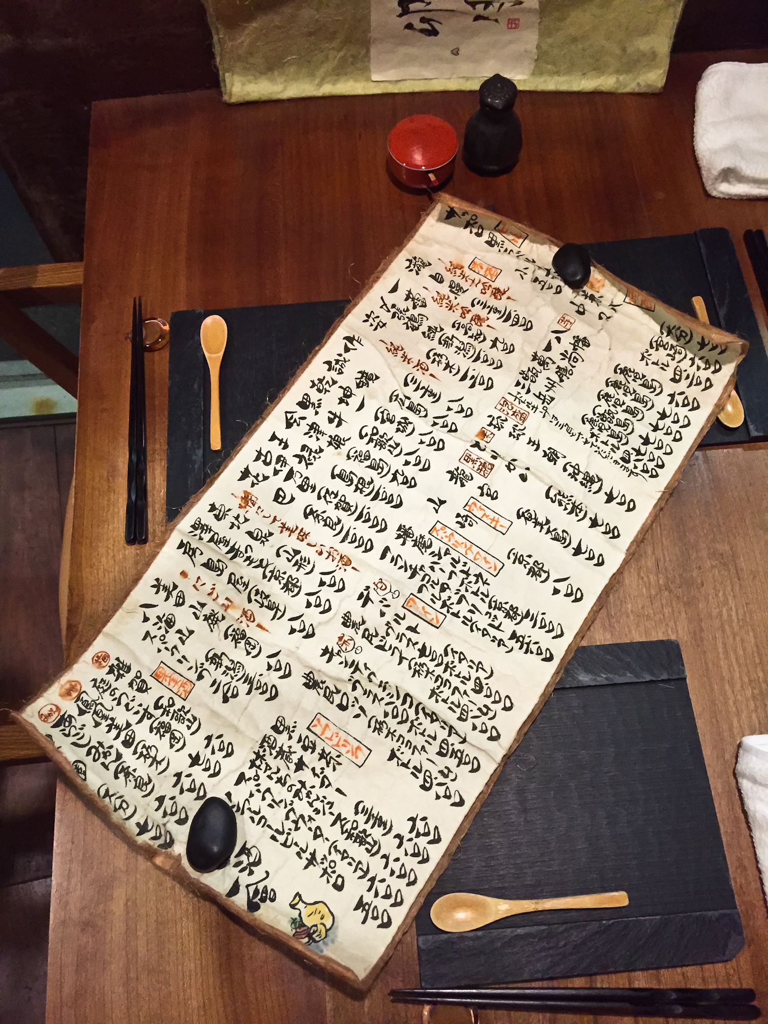
Ramen Chemistry was on tour in Japan last week, eating ramen and taking lots of pictures.  There's a lot to write about (ramen school, owl cafes, etc), but first I'll start posting photo sets, starting now with images of modern Japanese design.  I'll follow with food, gardens and shrines, and Tokyo scenes.  And, of course, owls.

Logo Design: Concept to Execution

Our logo concept was this.  The logo should feature a shiba inu.  The shiba either should be some sleek and abstract rendering, or an animation-style character image.  It shouldn't be too literal, but it also should be restrained; nothing too loud, nothing too cute.  It should evoke Japan without going over the top with a classic Japanese design aesthetic.  It could be based on a Japanese family crest, a mon, or on an approach like those taken (to successful visual effect) by Starbucks and Chipotle: concentric circles with an icon in the center and the name surrounding.   It should be a color that is bold but balanced, probably a variation on red, and it should be near-monotone.  It should strive to be eye-catching and memorable.  It should be capable of becoming iconic.  

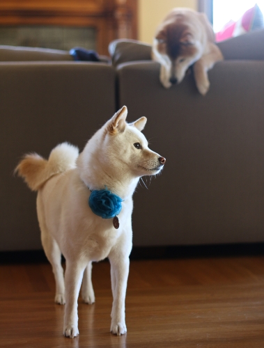
What a tail.

What a tail.

That, more or less, and over the course of several hours, was what we explained to our designer, Misa Grannis, when we met her in person for the first time.  We invited Misa over for dinner so we could get to know each other, and so we could explain to her who we are, where we're coming from, and what our motivations and goals are for Shiba Ramen.  Our view is that the better we all understand each other from the outset, the better we can work together toward the common goal.  Meeting our shibas here in their native habitat is also a pretty important part of the background.  

When Misa showed up carrying her personal copy of a book of Japanese mon seals, it confirmed our expectations that she would understand exactly what this project is trying to accomplish.  Also, did I mention that her actual initials are MSG?  Perfect person for the project.

Round One       

Misa took our guidance, went away for a few weeks, and then returned with a collection of prototypes.  She showed us a few dozen ideas in a sort of brainstorming exercise, the goal of which was to come to terms on the direction we wanted the project to take.  

One concept we liked was a shiba face, rounded in a circle, and bisected so that the bottom half was also a bowl of ramen.  This concept represented both the shiba and the ramen, and it was pretty streamlined.  It was cute, but not too much so. The second was Misa's attempt to infuse a shiba into the mitsudomoe mon.  And the third featured an S-shape meant to suggest the flourish of the shiba's distinctive tail.  We decided not to pursue concepts that appeared too traditional.

Brainstorming.  We considered a lot of concepts, but only pursued the three in the middle row and the one at lower left.  We asked Misa to try to hit a middle ground between the two mon concepts for the next round.  The othe…

Brainstorming.  We considered a lot of concepts, but only pursued the three in the middle row and the one at lower left.  We asked Misa to try to hit a middle ground between the two mon concepts for the next round.  The others we didn't pursue for either being too suggestive of ramen, dogs, or traditional Japanese style.  

Round Two

Misa came back two weeks later with a set of refinements.  She'd honed the shiba/bowl concept and the S-shape, and had made a dramatic improvement to the mon, which now featured a sharp design abstracting the shiba tail and ears.  But she also brought a bold new design using a stylized shiba silhouette set in a surrounding square.  

We were pretty excited about this new contender, and asked Misa to do some small refinements.  We also asked her to try a few text and color variations on the shiba/bowl.  We thought the mon was in good shape for the time being.  We decided the S-shape, while simple and elegant, just wasn't the distinctive look we were going for.  The objective was now to refine the shiba/bowl and the silhouette square, then evaluate them side-by-side with the mon.  

Refinements. Plus one standout new concept.

Refinements. Plus one standout new concept.

Non-Scientific Focus Group Exercise/Extended Rumination/Decision

Once Misa came back with her further refinements, we started taking an informal poll of friends and coworkers.  I showed the three concepts to 40-50 people and asked their opinion; I know that Misa and Hiroko also did some polling.  About 45% liked the shiba/bowl and 45% chose the silhouette.  10% or less picked the mon; most suggesting that it was too abstract and not really connecting with it.  I happen to like the mon, but I agree it doesn't resonate like the others.  We set it aside pretty quickly (although I would love to use it on a t-shirt at the store).

It was down to shiba/bowl and the silhouette.  The shiba/bowl had been the initial frontrunner, but a significant minority of people thought it was a cat, given the shape of the ears, the roundness of the face, and the chopsticks being suggestive of whiskers.  It turned out that this was a hard problem to resolve, especially because the roundness of the ramen bowl limited our ability to narrow the face.  

Finalists.  Mon (right) is struck first.  Then shiba/bowl goes, doomed perhaps by being too catlike.  Silhouette in the center strikes the right balance.  We have a winner!

Finalists.  Mon (right) is struck first.  Then shiba/bowl goes, doomed perhaps by being too catlike.  Silhouette in the center strikes the right balance.  We have a winner!

But just by letting some time pass, it was easy to make up our minds.  Upon reflection, the silhouette was hands-down the best overall design, and it fit most closely with our ideal.  The silhouette was the clear choice for Shiba Ramen.

Next time, I'll tell you about our final logo task: picking the right Japanese text.  But I'll do it by explaining  the different types of characters used in written Japanese (it's not just a simple alphabet) and the different design options they create.  

Branding Step Two: A Face for Shiba Ramen

Last summer, with the aid of the state bureaucracy and a small filing fee, we breathed life into Shiba Ramen Corporation.  Just like that--poof--a California S corporation was born.  With corporate personhood thus achieved--yes, non-lawyer readers, corporations are people, too--Shiba Ramen needed a face.  So we set out to give it one.  Over the next few posts, I'm going to explain, step-by-step, how we did it, from our initial inspirations, to the various prototype logos we considered along the way, to the last bits of fine tuning before we finally said, "this is it!"

Mon of the Tokugawa Clan. The Tokugawa consolidated power over feudal Japan in 1603 and their hereditary military dictatorship--the Tokugawa Shogunate--ruled Japan until 1867.

Mon of the Tokugawa Clan. The Tokugawa consolidated power over feudal Japan in 1603 and their hereditary military dictatorship--the Tokugawa Shogunate--ruled Japan until 1867.

Vague Ideas

In Branding Step One, I explained that our shiba inu dogs were the central inspiration behind the name Shiba Ramen.  We knew from the start that we wanted to feature the shiba in our logo.  These very Japanese dogs have a unique look: pointy ears, curly and bushy tails, and distinctive coat markings.  They're at once cute, elegant, and noble.  Beyond saying something personal about us, having a shiba in our logo would give people an easy piece of visual imagery to associate with and remember our business.  

Now here's the thing.  It was clear to us that a delicate balance must be struck.  There are risks in having a logo that's too "doglike," especially for a food business.  There are also risks in having a logo that's too cute.  We needed a logo that captures something essential about the shiba inu, all while keeping a design aesthetic that represents the overall look and feel we want to project for the business.  Our view was that some kind of abstraction of the shiba's distinctive shape was probably the right way to go for us, but that something more on the cute side was a possibility.  

So there was a vague vision in place, a sense of the right aesthetic.  How do you then translate that into a product you're excited to go forward with as the face of your business?

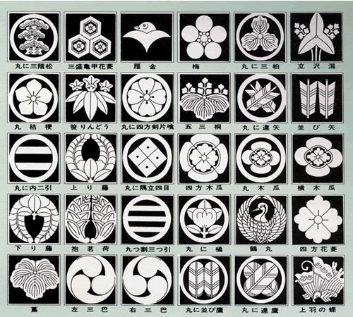
Mon.  Traditional Japanse family crests. http://samuraitradition.tumblr.com/post/37191914793

Mon.  Traditional Japanse family crests. http://samuraitradition.tumblr.com/post/37191914793

Japanese Influences

While we looked for a designer to help us, Hiroko spent some time mocking out a couple of rough ideas.  She used Open Office to draw out some designs that might help set our initial direction.  Hiroko thought that something based on a traditional Japanese family seal--a mon--might be a good direction to go.  

Mon originated as heraldic crests of the feudal Japanese nobility, and were gradually adopted by the rest of the population.  In terms of designmon are always monochromatic, usually round, and often characterized by geometric symmetries or the use of nature imagery.

Mon logos. Sushirrito uses a modern and more colorful take to nice effect (left).  Mitsubishi uses an actual family crest (center).  Berkeley Bowl uses a mon made of carrots.

Mon logos. Sushirrito uses a modern and more colorful take to nice effect (left).  Mitsubishi uses an actual family crest (center).  Berkeley Bowl uses a mon made of carrots.

It turns out that some well-known businesses actually use mon-inspired logos.  Examples include Mitsubishi, which uses the Mitsubishi family three-diamond mon (the word mitsubishi literally translates to "three diamonds").  Here in the Bay Area, Berkeley Bowl (home of the most glorious produce section I've ever seen), Sushirrito, and Monterey Market all use mon.  

For our purposes, we wondered if we could capture the essential features of the shiba, heavily abstracted, in the style of a mon.  Hiroko sketched out a very rough idea of representing the shiba's ears and tail in the style of a mitsudomoe, a mon that looks like three comma-shaped swirls, and is a fairly common design element in Japan.  The result looked sort of distorted and extreme, but we thought it could be viable in the hands of a trained designer.  I asked what my good friend Angel thought, and she likened image to "spiky whale sperms."  This logo was going to take some working through.

Can Somebody Help With This?  Our rough first draft modified the swirls of the mitsudomoe mon to represent the shiba's curly tail and pointy ears. 

Can Somebody Help With This?  Our rough first draft modified the swirls of the mitsudomoe mon to represent the shiba's curly tail and pointy ears. 

Know When You Need a Professional

Obviously, we needed a professional to work with us.  We don't have any graphic design training, but that's not too important.  What's important for us as business owners is to be able to find the right person for the job, make sure that person understands where we want to go, and then having a good sense of what we like and don't like when we see it.  And we need to be able to give the designer good feedback along the way.  It's up to the designer to mock everything out and then go through iterative refinements en route to the final product.

We weren't sure where to go to find the right designer.  We're obviously budget-conscious as a brand-new company with a lot of costs coming down the road, so we couldn't go to some established design firm.  We needed an individual who could work with us on a freelance basis, and who would be willing to get to know us and get a bit immersed in the broader Shiba Ramen project.  

We briefly considered crowdsourcing our logo--you can set up online competitions where you post your project and the price you're willing to pay, and designers from the online community will submit designs for you to consider.  This could be convenient, but we really had no idea what to expect in terms of quality or service.  We would be more comfortable if we had an actual collaborator and a face-to-face dialogue.

Pointy Ears, Curly Tail.  Can someone please turn this into a sleek and effective logo?  Toro in Mountain View, CA.

Pointy Ears, Curly Tail.  Can someone please turn this into a sleek and effective logo?  Toro in Mountain View, CA.

It was our great fortune that we found one on the first attempt.  We were introduced to the very talented Misa Grannis by my friend Angel.  When I looked at her website, I learned that she's half-Japanese, speaks Japanese, studied in Japan, is a designer and architect-in-training, and lives right here in Oakland.  Misa had been a bridesmaid in Angel's wedding just a few weeks earlier, so we'd seen her face-to-face before (she'd given a very sincere toast to the happy couple).  That kind of thing--having seen someone live and in-person--is actually important when you're looking for somebody to help you with a job that's as personal as this one was to us.  

When I contacted Misa, I learned that she was an even more qualified candidate than I'd first thought.  She's eaten a ton of ramen, and knows it pretty well, and she loves shiba inus.  Based on everything we'd learned, we realized that there couldn't be a more perfect fit for this project than Misa.  We were pretty sure we were going to hire her even before we met with her, and we never thought it was necessary to talk to anyone else.  She got the job.  And we got off very easy on our designer search.

In the next post, I'll show you how Misa tried to work a shiba into the mitsudomoe mon, along with the other avenues we pursued before making our decision.