Japan Design Photography

Ramen Chemistry was on tour in Japan last week, eating ramen and taking lots of pictures.  There's a lot to write about (ramen school, owl cafes, etc), but first I'll start posting photo sets, starting now with images of modern Japanese design.  I'll follow with food, gardens and shrines, and Tokyo scenes.  And, of course, owls.

Logo Design: Concept to Execution

Our logo concept was this.  The logo should feature a shiba inu.  The shiba either should be some sleek and abstract rendering, or an animation-style character image.  It shouldn't be too literal, but it also should be restrained; nothing too loud, nothing too cute.  It should evoke Japan without going over the top with a classic Japanese design aesthetic.  It could be based on a Japanese family crest, a mon, or on an approach like those taken (to successful visual effect) by Starbucks and Chipotle: concentric circles with an icon in the center and the name surrounding.   It should be a color that is bold but balanced, probably a variation on red, and it should be near-monotone.  It should strive to be eye-catching and memorable.  It should be capable of becoming iconic.  

What a tail.

What a tail.

That, more or less, and over the course of several hours, was what we explained to our designer, Misa Grannis, when we met her in person for the first time.  We invited Misa over for dinner so we could get to know each other, and so we could explain to her who we are, where we're coming from, and what our motivations and goals are for Shiba Ramen.  Our view is that the better we all understand each other from the outset, the better we can work together toward the common goal.  Meeting our shibas here in their native habitat is also a pretty important part of the background.  

When Misa showed up carrying her personal copy of a book of Japanese mon seals, it confirmed our expectations that she would understand exactly what this project is trying to accomplish.  Also, did I mention that her actual initials are MSG?  Perfect person for the project.

Round One       

Misa took our guidance, went away for a few weeks, and then returned with a collection of prototypes.  She showed us a few dozen ideas in a sort of brainstorming exercise, the goal of which was to come to terms on the direction we wanted the project to take.  

One concept we liked was a shiba face, rounded in a circle, and bisected so that the bottom half was also a bowl of ramen.  This concept represented both the shiba and the ramen, and it was pretty streamlined.  It was cute, but not too much so. The second was Misa's attempt to infuse a shiba into the mitsudomoe mon.  And the third featured an S-shape meant to suggest the flourish of the shiba's distinctive tail.  We decided not to pursue concepts that appeared too traditional.

Brainstorming.  We considered a lot of concepts, but only pursued the three in the middle row and the one at lower left.  We asked Misa to try to hit a middle ground between the two mon concepts for the next round.  The othe…

Brainstorming.  We considered a lot of concepts, but only pursued the three in the middle row and the one at lower left.  We asked Misa to try to hit a middle ground between the two mon concepts for the next round.  The others we didn't pursue for either being too suggestive of ramen, dogs, or traditional Japanese style.  

Round Two

Misa came back two weeks later with a set of refinements.  She'd honed the shiba/bowl concept and the S-shape, and had made a dramatic improvement to the mon, which now featured a sharp design abstracting the shiba tail and ears.  But she also brought a bold new design using a stylized shiba silhouette set in a surrounding square.  

We were pretty excited about this new contender, and asked Misa to do some small refinements.  We also asked her to try a few text and color variations on the shiba/bowl.  We thought the mon was in good shape for the time being.  We decided the S-shape, while simple and elegant, just wasn't the distinctive look we were going for.  The objective was now to refine the shiba/bowl and the silhouette square, then evaluate them side-by-side with the mon.  

Refinements. Plus one standout new concept.

Refinements. Plus one standout new concept.

Non-Scientific Focus Group Exercise/Extended Rumination/Decision

Once Misa came back with her further refinements, we started taking an informal poll of friends and coworkers.  I showed the three concepts to 40-50 people and asked their opinion; I know that Misa and Hiroko also did some polling.  About 45% liked the shiba/bowl and 45% chose the silhouette.  10% or less picked the mon; most suggesting that it was too abstract and not really connecting with it.  I happen to like the mon, but I agree it doesn't resonate like the others.  We set it aside pretty quickly (although I would love to use it on a t-shirt at the store).

It was down to shiba/bowl and the silhouette.  The shiba/bowl had been the initial frontrunner, but a significant minority of people thought it was a cat, given the shape of the ears, the roundness of the face, and the chopsticks being suggestive of whiskers.  It turned out that this was a hard problem to resolve, especially because the roundness of the ramen bowl limited our ability to narrow the face.  

Finalists.  Mon (right) is struck first.  Then shiba/bowl goes, doomed perhaps by being too catlike.  Silhouette in the center strikes the right balance.  We have a winner!

Finalists.  Mon (right) is struck first.  Then shiba/bowl goes, doomed perhaps by being too catlike.  Silhouette in the center strikes the right balance.  We have a winner!

But just by letting some time pass, it was easy to make up our minds.  Upon reflection, the silhouette was hands-down the best overall design, and it fit most closely with our ideal.  The silhouette was the clear choice for Shiba Ramen.

Next time, I'll tell you about our final logo task: picking the right Japanese text.  But I'll do it by explaining  the different types of characters used in written Japanese (it's not just a simple alphabet) and the different design options they create.  

Branding Step Two: A Face for Shiba Ramen

Last summer, with the aid of the state bureaucracy and a small filing fee, we breathed life into Shiba Ramen Corporation.  Just like that--poof--a California S corporation was born.  With corporate personhood thus achieved--yes, non-lawyer readers, corporations are people, too--Shiba Ramen needed a face.  So we set out to give it one.  Over the next few posts, I'm going to explain, step-by-step, how we did it, from our initial inspirations, to the various prototype logos we considered along the way, to the last bits of fine tuning before we finally said, "this is it!"

Mon of the Tokugawa Clan. The Tokugawa consolidated power over feudal Japan in 1603 and their hereditary military dictatorship--the Tokugawa Shogunate--ruled Japan until 1867.

Mon of the Tokugawa Clan. The Tokugawa consolidated power over feudal Japan in 1603 and their hereditary military dictatorship--the Tokugawa Shogunate--ruled Japan until 1867.

Vague Ideas

In Branding Step One, I explained that our shiba inu dogs were the central inspiration behind the name Shiba Ramen.  We knew from the start that we wanted to feature the shiba in our logo.  These very Japanese dogs have a unique look: pointy ears, curly and bushy tails, and distinctive coat markings.  They're at once cute, elegant, and noble.  Beyond saying something personal about us, having a shiba in our logo would give people an easy piece of visual imagery to associate with and remember our business.  

Now here's the thing.  It was clear to us that a delicate balance must be struck.  There are risks in having a logo that's too "doglike," especially for a food business.  There are also risks in having a logo that's too cute.  We needed a logo that captures something essential about the shiba inu, all while keeping a design aesthetic that represents the overall look and feel we want to project for the business.  Our view was that some kind of abstraction of the shiba's distinctive shape was probably the right way to go for us, but that something more on the cute side was a possibility.  

So there was a vague vision in place, a sense of the right aesthetic.  How do you then translate that into a product you're excited to go forward with as the face of your business?

Mon.  Traditional Japanse family crests. http://samuraitradition.tumblr.com/post/37191914793

Mon.  Traditional Japanse family crests. http://samuraitradition.tumblr.com/post/37191914793

Japanese Influences

While we looked for a designer to help us, Hiroko spent some time mocking out a couple of rough ideas.  She used Open Office to draw out some designs that might help set our initial direction.  Hiroko thought that something based on a traditional Japanese family seal--a mon--might be a good direction to go.  

Mon originated as heraldic crests of the feudal Japanese nobility, and were gradually adopted by the rest of the population.  In terms of designmon are always monochromatic, usually round, and often characterized by geometric symmetries or the use of nature imagery.

Mon logos. Sushirrito uses a modern and more colorful take to nice effect (left).  Mitsubishi uses an actual family crest (center).  Berkeley Bowl uses a mon made of carrots.

Mon logos. Sushirrito uses a modern and more colorful take to nice effect (left).  Mitsubishi uses an actual family crest (center).  Berkeley Bowl uses a mon made of carrots.

It turns out that some well-known businesses actually use mon-inspired logos.  Examples include Mitsubishi, which uses the Mitsubishi family three-diamond mon (the word mitsubishi literally translates to "three diamonds").  Here in the Bay Area, Berkeley Bowl (home of the most glorious produce section I've ever seen), Sushirrito, and Monterey Market all use mon.  

For our purposes, we wondered if we could capture the essential features of the shiba, heavily abstracted, in the style of a mon.  Hiroko sketched out a very rough idea of representing the shiba's ears and tail in the style of a mitsudomoe, a mon that looks like three comma-shaped swirls, and is a fairly common design element in Japan.  The result looked sort of distorted and extreme, but we thought it could be viable in the hands of a trained designer.  I asked what my good friend Angel thought, and she likened image to "spiky whale sperms."  This logo was going to take some working through.

Can Somebody Help With This?  Our rough first draft modified the swirls of the mitsudomoe mon to represent the shiba's curly tail and pointy ears. 

Can Somebody Help With This?  Our rough first draft modified the swirls of the mitsudomoe mon to represent the shiba's curly tail and pointy ears. 

Know When You Need a Professional

Obviously, we needed a professional to work with us.  We don't have any graphic design training, but that's not too important.  What's important for us as business owners is to be able to find the right person for the job, make sure that person understands where we want to go, and then having a good sense of what we like and don't like when we see it.  And we need to be able to give the designer good feedback along the way.  It's up to the designer to mock everything out and then go through iterative refinements en route to the final product.

We weren't sure where to go to find the right designer.  We're obviously budget-conscious as a brand-new company with a lot of costs coming down the road, so we couldn't go to some established design firm.  We needed an individual who could work with us on a freelance basis, and who would be willing to get to know us and get a bit immersed in the broader Shiba Ramen project.  

We briefly considered crowdsourcing our logo--you can set up online competitions where you post your project and the price you're willing to pay, and designers from the online community will submit designs for you to consider.  This could be convenient, but we really had no idea what to expect in terms of quality or service.  We would be more comfortable if we had an actual collaborator and a face-to-face dialogue.

Pointy Ears, Curly Tail.  Can someone please turn this into a sleek and effective logo?  Toro in Mountain View, CA.

Pointy Ears, Curly Tail.  Can someone please turn this into a sleek and effective logo?  Toro in Mountain View, CA.

It was our great fortune that we found one on the first attempt.  We were introduced to the very talented Misa Grannis by my friend Angel.  When I looked at her website, I learned that she's half-Japanese, speaks Japanese, studied in Japan, is a designer and architect-in-training, and lives right here in Oakland.  Misa had been a bridesmaid in Angel's wedding just a few weeks earlier, so we'd seen her face-to-face before (she'd given a very sincere toast to the happy couple).  That kind of thing--having seen someone live and in-person--is actually important when you're looking for somebody to help you with a job that's as personal as this one was to us.  

When I contacted Misa, I learned that she was an even more qualified candidate than I'd first thought.  She's eaten a ton of ramen, and knows it pretty well, and she loves shiba inus.  Based on everything we'd learned, we realized that there couldn't be a more perfect fit for this project than Misa.  We were pretty sure we were going to hire her even before we met with her, and we never thought it was necessary to talk to anyone else.  She got the job.  And we got off very easy on our designer search.

In the next post, I'll show you how Misa tried to work a shiba into the mitsudomoe mon, along with the other avenues we pursued before making our decision.  


Japan: So Weird, So Awesome (Episode 1, Love Hotels)

I'm excited to announce that Ramen Chemistry is going to Tokyo next month for a ramen and culture tour.  Among other things, I will experience wonderful food, strange and magical toilets, and, best of all, a week-long holiday from having to understand literally anything that is spoken in my general vicinity.  The blogging opportunity inherent in such a trip should be self-evident.  To get ready, Ramen Chemistry will warm up with a few posts about things Japanese.  Starting now with "love hotels."

Hotel Queen Elizabeth. I'm sure Her Majesty is honored.

Hotel Queen Elizabeth. I'm sure Her Majesty is honored.

Japan: Full of Surprises

To be sure, any American's first trip to Japan is something of a revelation.  My first trip in 2003 was no exception.  The most pedestrian places, supermarkets and convenient stores, were worlds of fascination.  Strange sights, stranger sounds, an overabundance of cuteness.  You get what I'm saying.  But I'll tell you this: nothing--nothing--prepared me for the epic weirdness of that very curious and very ubiquitous Japanese phenomenon, the love hotel.   

Allow me to set the stage.  We were making our way from Tokyo to Kyoto, and had stopped in the Izu Peninsula to meet Hiroko's childhood friend.  When we needed a hotel that night and didn't have a reservation, Hiroko thought a love hotel might be convenient and educational for her American boyfriend (who, by the way, had never previously left the United States).  It was late enough to get a room.  Love hotels, it turns out, won't rent you a room for the night until as late as 10 or 11 p.m.  Before that, you can only rent the room for a couple-hour "rest."  You don't make a reservation at a love hotel.

Will It Be a "Stay" or a "Rest"?  Rate chart for a love hotel.  A "stay" is overnight, and a "rest" is a few hours.  

Will It Be a "Stay" or a "Rest"?  Rate chart for a love hotel.  A "stay" is overnight, and a "rest" is a few hours.  

We found a place--Hotel 555--and pulled into an underground parking garage.  There, we found a succession of parking stalls, a special one dedicated to each room in the hotel.  Lots of the stalls were full when we arrived.  But get this--covering the license plate of every parked car was a  portable screen.  And we paid for the room not by going to a check-in counter, but by inserting cash into a payment machine in our garage stall.  The machine gave us access to the room; we never even got a key.  This was new.  This would be educational.  

Cloak-and-Dagger.  Love hotel parking lot. http://thejapans.org/tag/hotels/

Cloak-and-Dagger.  Love hotel parking lot. http://thejapans.org/tag/hotels/

We entered our room through a door in the back of the stall, and found slippers waiting for us at the threshold.  One does not wear shoes inside in Japan in domestic quarters--ever--even in a love hotel.  The room was pretty unbelievable, at least to my naive American eyes.  A garish pink cupid hung above the gigantic bed and a disco ball hung from the ceiling.  And what amenities!  Baskets of condoms, bottles of oils and lotions, a karaoke machine, video games and DVDs, blue and green underwater lights in a gigantic jacuzzi tub, a tv loaded with porno channels (with all the sensitive parts blurred out, per Japanese law), and, strangest of all, a small display refrigerator containing beer and Haagen Dazs for purchase.  And dildos.  Right there, next to the ice cream.  

Love Hotel Menu.  Just pick your room, press the button, and you're set.

Love Hotel Menu.  Just pick your room, press the button, and you're set.

Multibillion Dollar Industry

Apparently there are 25,000 love hotels in Japan (another report says 37,000).  It's a $40 billion industry.  Love hotels are usually found around places like highway interchanges or city outskirts.  They usually have funny non-Japanese names: Hotel Patio, Hotel L'Hermitage, Hotel Chapel Christmas, and my personal favorite, Hotel Seeds.  The exteriors are often thematic (i.e., castle theme) but sometimes non-descript or windowless.  But it doesn't take long to be able to identify a love hotel anywhere you go in Japan.  The combination of name, signage, and location will almost always give it away.

Good Old Hotel Seeds.  This is a pretty common image in Japan.  

Good Old Hotel Seeds.  This is a pretty common image in Japan.  

Inside the love hotel, there's often a menu of room choices.  The rooms might be distinguished by theme (a new take on Hello Kitty, for example), by decor, or by the presence of a special piece of sex furniture (what does that even mean, right?).  There are pictures of the rooms, descriptions, and you pick the one you want.  Here's a link to the room selections at one Hotel Seeds (yes, it's a chain).

But don't get the impression that these places are necessarily seedy.  Never forget we are in Japan here. The Japanese are pretty fastidious and they highly value, even expect, good customer service and cleanliness.  So love hotels are properly thought of as mainstream and respectable businesses.  Customers are often young adults who happen to be much more likely to be living with their parents into their 20s than are their U.S. counterparts, and who require more privacy than they can get at home.  On the other hand, it should be obvious to you that Hotel Seeds isn't the Mandarin Oriental.  

A documentary called Love Hotel came out last year, set in Osaka's Angel Love Hotel.  It's streaming on Netflix (so I just learned).  It's now in Ramen Chemistry's list and set for immediate viewing.

Hello Kitty.  I didn't expect to see you here.  And certainly not in handcuffs.

Hello Kitty.  I didn't expect to see you here.  And certainly not in handcuffs.

The Pneumatic Tube

Love hotels operate based on a principle of total anonymity. During your stay, the odds are you will never see anyone face-to-face.  Not a concierge, not a maid, nobody.  If you need customer service you talk to somebody on the phone.  This is why those cars had screens over their license plates.  

Usually, you pay a machine, but sometimes even more elaborate and gratuitous schemes are used.  I once saw a room where you pay upon departure using a pneumatic tube (think bank drive-throughs), that shuttles between your room and an office in another part of the hotel.

Please Pay Here.  Pneumatic tube facilitates the anonymity of the Japanese love hotel.  Photo credit: Karl Baron.

Please Pay Here.  Pneumatic tube facilitates the anonymity of the Japanese love hotel.  Photo credit: Karl Baron.

This level of anonymity pretty clearly sells in Japan.  Undoubtedly it lowers the barrier to rent a room, easing customers past their inhibitions.  I'm also guessing that a lot of people like the secrecy thing as a fun part of the overall experience.

After Hotel 555, I confess I made Hiroko take me to love hotels a few more times.  It's a pretty extreme cultural novelty, and there was always some over-the-top or absurd detail that made the amusement alone worth the trip.  The other thing, believe it or not, is that there aren't a whole lot of economy hotels on Japan's roadways.  So if you're traveling, it's late, and you don't have reservations, you'll find that instead of a Comfort Inn at the highway exit, there's a love hotel.  

If you are interested and want to read more about love hotels, click here, here, and here.  There's a ton of stuff on the web, but these links are a good starting point.   

Branding Step One: Choosing the Right Name

We settled on the name Shiba Ramen long before we were remotely serious about starting a company, back when this project was just some obscure weekend fantasy, bandied about in between billing hours at the firm and changing diapers at home (fyi, the only thing that's changed in the intervening 9 months is that today we actually work on the business in between billing hours and changing diapers).  Shiba Ramen was intuitive to us, and we never seriously considered a different name.  Let me explain why.

Muses.  Our shibas, Momo (white) and Toro (red)

Muses.  Our shibas, Momo (white) and Toro (red)

A name is significant.  If you're a business, you make a conscious choice when you select your name.  You hope it helps customers identify and connect with you.  You want it to be easily spoken, and easily remembered.  And you want it to say something about you, to be part of your narrative.  Shiba Ramen is both functional and personal, and that's why we chose it.  We think it works for our business at the same time it says something about us.  

Distinction Is Critical

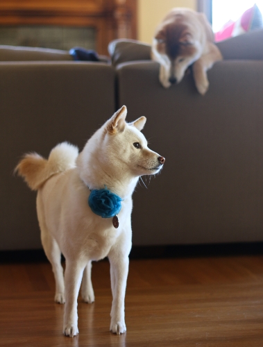
The first point is that the word "Shiba" is distinctive, just as a business's name needs to be to set it apart from its competitors, or even from general background noise.  It is an arbitrary word in that it has nothing to do with ramen, noodles, or even food.  Not many other companies or products (if any) use this word, at least here in the U.S. 

There's also an important legal reason to have a distinctive name, if you want intellectual property protection for your brand.  Federal trademark law is based on protecting distinctiveness.  The law gives the most protection to brand names that are "arbitrary" or "fanciful"--i.e., names that don't suggest or describe the nature of the product, either because they are entirely made-up words or because they are common words that don't hint at anything about the underlying product.  

Think about names like Xerox, Apple, Starbucks, and as the U.S. Patent & Trademark Office notes, Old Crow Whiskey (a good friend of mine in college, as it happens).  Names like this are "inherently distinctive" so that the government will grant a trademark without much red tape.  If you choose a name that describes your product (lets make up an example--"Noodles Ramen"), you have to prove to the government that customers out in the marketplace actually associate that name with you.  That's a real practical difference:  by using Shiba Ramen, I can apply (and have) for my trademark now and expect to get it, but if I picked Noodles Ramen, I'd probably have to be in business for quite a while and develop a serious reputation before the government would be willing to put its weight behind my alleged economic interest and give me a trademark.  

So Are Authenticity and Accessibility 

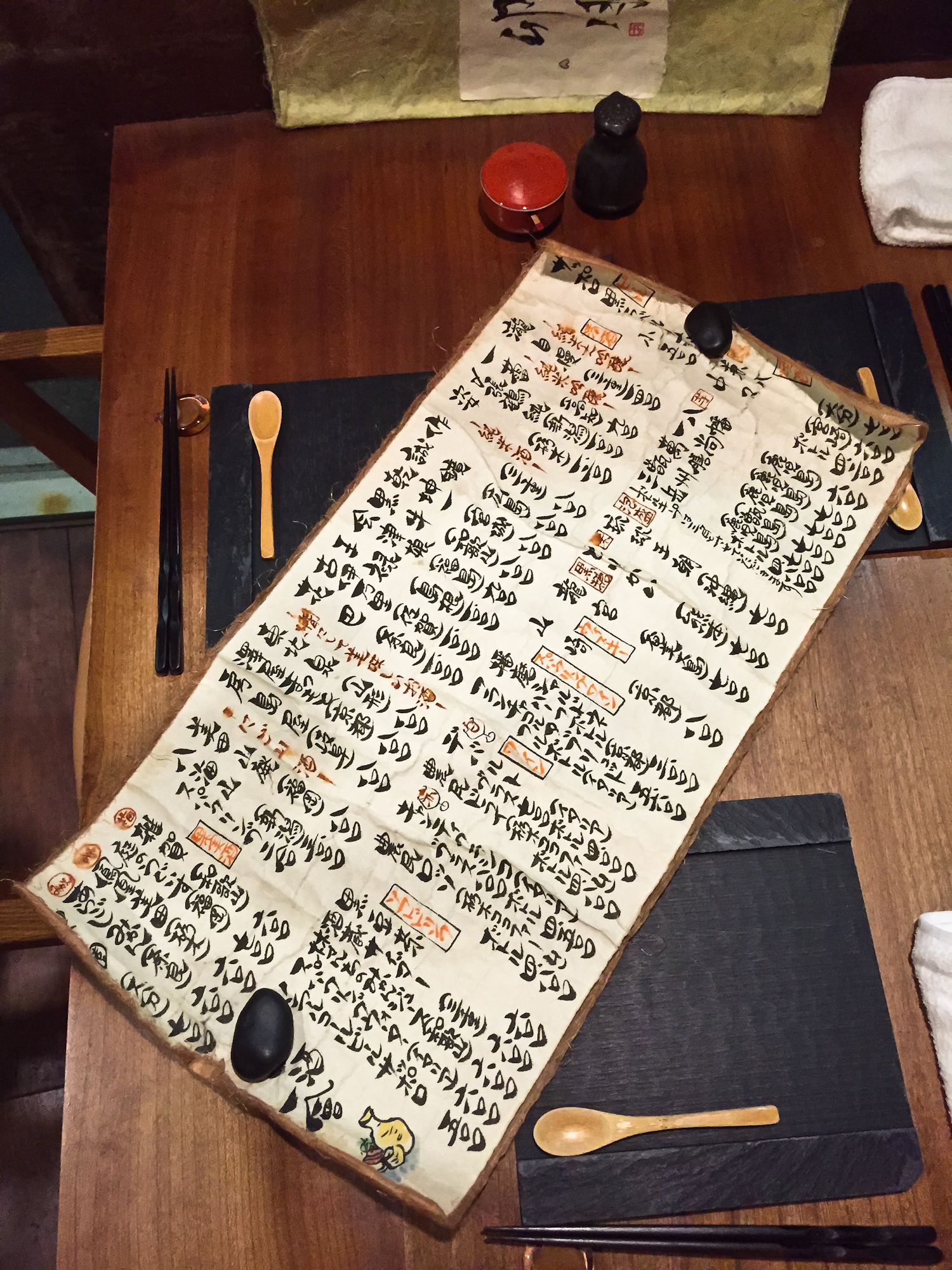
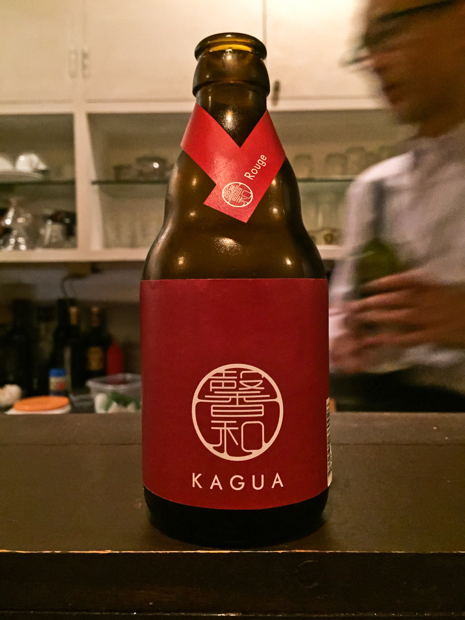
"Shiba" is short--five letters, two syllables--and easy to remember in English.  That's important, and it ties into the second reason we chose our name.  Shiba is a Japanese word.  We wanted to use a Japanese word to emphasize that our product is authentically Japanese, that it's the real thing, done the right way.  Also to reflect Hiroko's Japanese heritage, which is important to us and to our family.  

Hamamatsu Ramen?  Naming our business after Hiroko's hometown (for example) just wouldn't have the same impact.

Hamamatsu Ramen?  Naming our business after Hiroko's hometown (for example) just wouldn't have the same impact.

But if we're intent on a Japanese name, it has to be something that is easily remembered and passed along by westerners.  If a name is too foreign, I think it's just harder to remember.  We have a harder time internalizing sounds that don't follow a familiar pattern.  Shiba is a word that I think people can get.  One reason for this I think is that "Sheba" with an "e" is a word we're already familiar with in the West, probably because of the biblical Queen of Sheba.  More than one person has mistakenly spelled our company's name with an "e".  The point is that Shiba (we think) strikes the appropriate balance between authenticity and public accessibility.    

Wrong Shiba.  But maybe the Queen of Sheba makes our name easier to remember.  The Meeting of Solomon and the Queen of Sheba, Circle of Juan de la Corte (Belgian), early 17th Century

Wrong Shiba.  But maybe the Queen of Sheba makes our name easier to remember.  The Meeting of Solomon and the Queen of Sheba, Circle of Juan de la Corte (Belgian), early 17th Century

Crazy About Those Dogs

The third reason for our name is personal, and explains why it was so easy for us to commit to calling ourselves Shiba Ramen.  The literal translation of "shiba" is "brushwood," but shrubs are beside the point.  It's the shiba inu ("inu" is Japanese for "dog") that we care about.  The shiba inu is the iconic Japanese fox-like dog with pointed ears and a curly tail.  We are dedicated and enthusiastic owners of two of these unique and amazing dogs, Toro and Momo.  Crazy about these dogs, to be honest.  Like really nuts.  I'll write more about them later. 

Shibas are universally associated with Japan; they're a cultural icon of sorts.  And they've become really popular in the U.S. over the past decade or so (fueled, perhaps, by the shiba "puppy cam" that was viral on the Internet a few years ago).  So the shiba--this very Japanese image--is slowly entering the American cultural vernacular, just as the word is starting to enter our language.  Our name comes with built-in imagery, and the imagery in turn acts as a hook to help people remember our name.    

Dogchildren.  Toro and Momo in 2013

Dogchildren.  Toro and Momo in 2013

Now you understand why we are Shiba Ramen.  Ramen Chemistry would have been a good alternative, for a lot of the reasons I've explained (we are former chemists, after all), but we think that name fits better with the theme of this blog. 

Next time, I'll explain how we went about creating our Shiba Ramen logo.