Ramen Chemistry Underwater: Shiba Ramen Crunch Time Status Update

Ramen Chemistry, have you been on vacation? You don’t call (not that you ever really did), and you certainly don’t write. The Internet says it needs more real-time chronicling of restaurant startup minutiae! Come back!

Well, when things get crazy, the blog is the first thing to go. So you can tell the Internet that Ramen Chemistry has a mortgage and he needs to put food on the table, not to mention that he has to subsidize birthday parties at Children’s Fairyland and trips to Train Town. In other words, Ramen Chemistry has a day job that provides necessary things like “money.” The old day job is busier than at any point in the past two years.  Cases are coming out of the woodwork.  Rather inconvenient, to say the least.  

And then there's that other thing going on.  Shiba Ramen is opening soon!  Like really shockingly soon, especially given the amount of buildup.  So Ramen Chemistry is busy performing tasks all and sundry, converting that day job money into an untold array of goods and services.  Contributing to the economy!  And after all that making and spending of money (how’s that balance sheet, anyway?) there still has to be time to hit Train Town, ride the rides, feed the llamas, etc.

As people are fond of saying in our American Cult[ure] of Work, Ramen Chemistry is underwater. Deep, deep underwater. But here on the NX1 bus from SF to Oakland, I’m finding a few minutes to bubble a Shiba Ramen update to the surface. . . 

Progress. It Creeps Up On You.

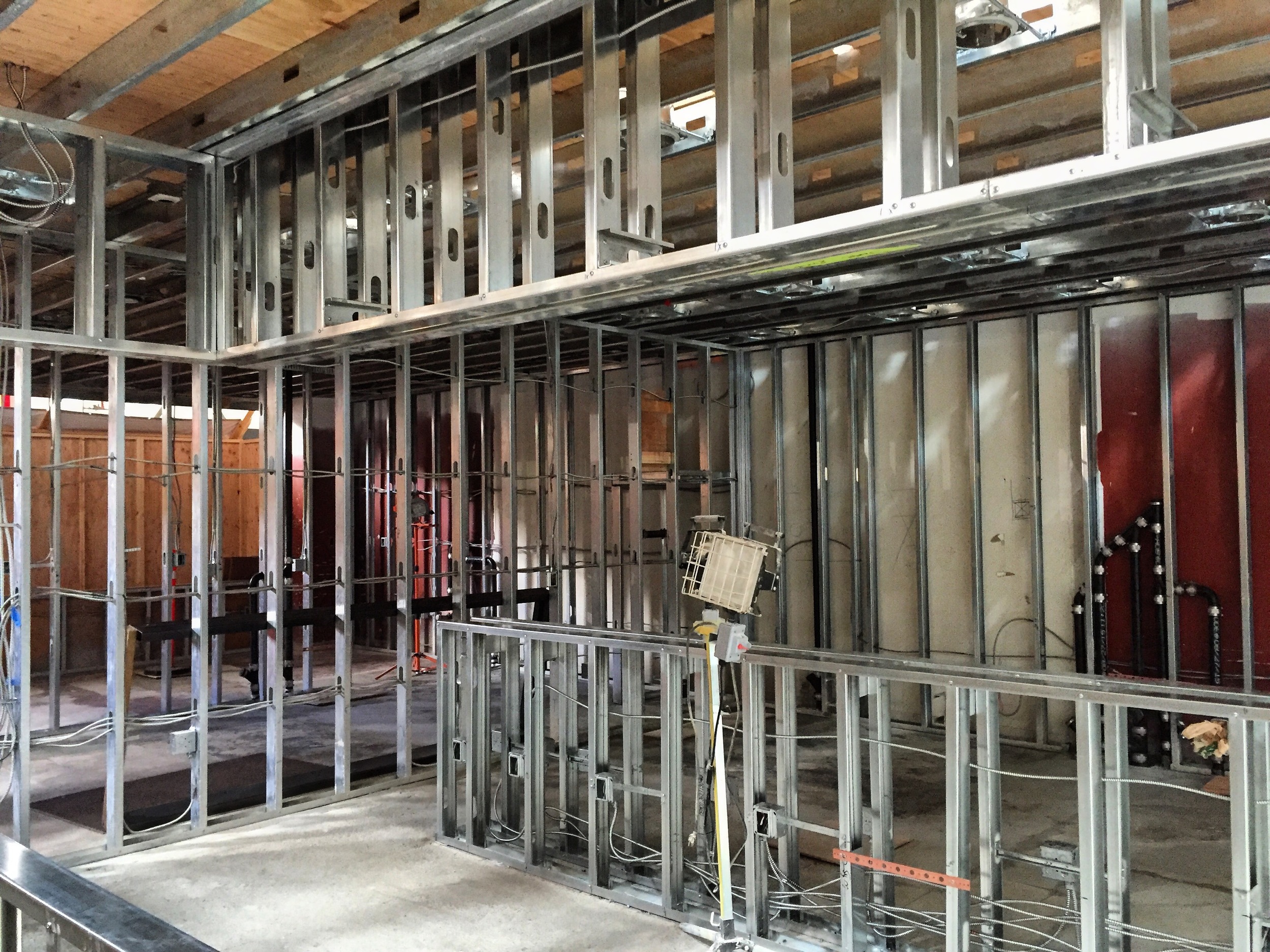
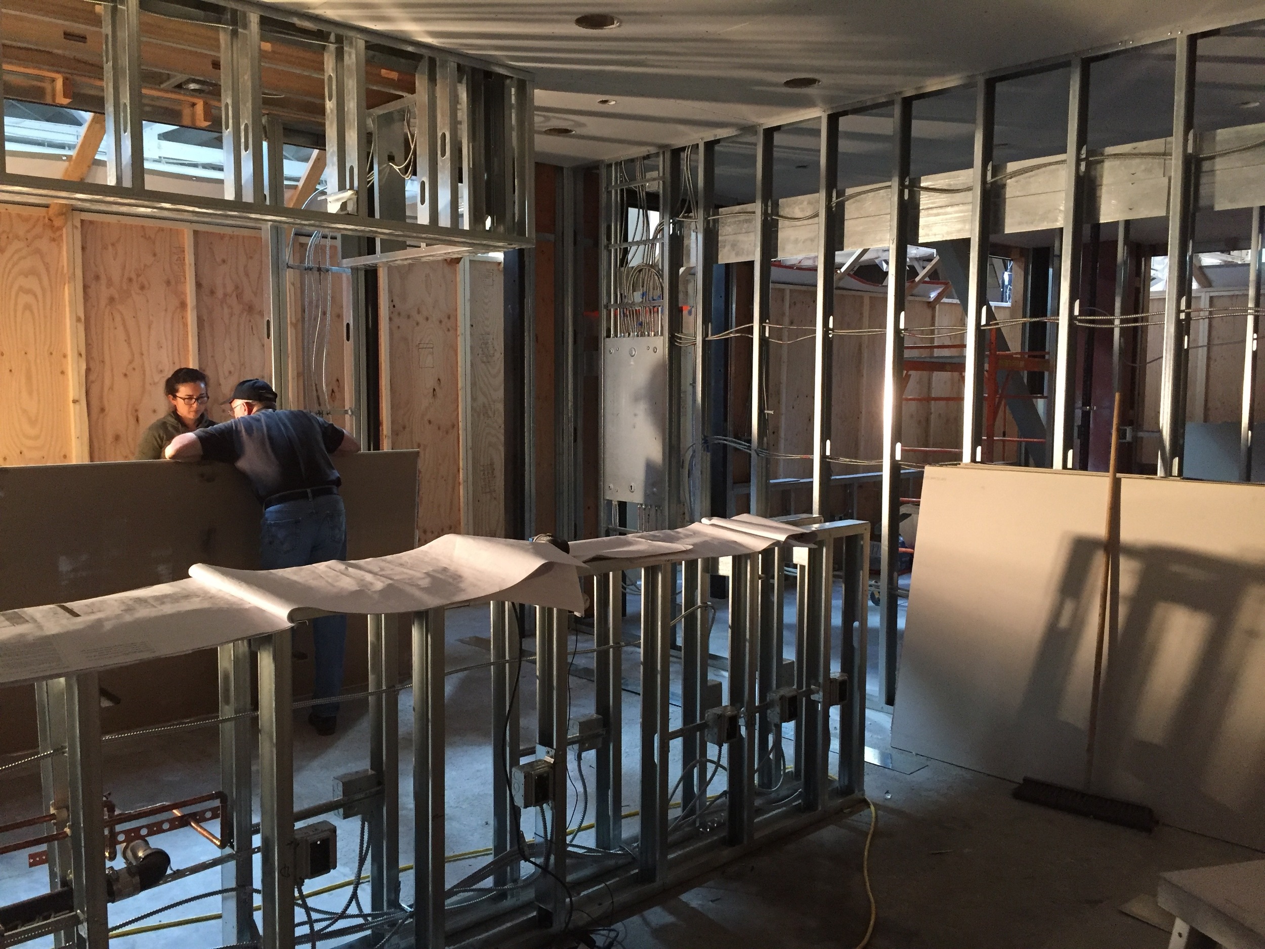
Things are happening, people. After that long slow march toward a set of construction plans and the selection of a contractor, Shiba Ramen is really on the verge of being a real functioning thing. A week ago, the space was still ringed with metal studs. A few days later, it had walls and a ceiling. Now equipment is starting to arrive for installation and finishes are just about to go in.  Tomorrow Hiroko will spend the day supervising the tile subcontractor while they install our awesome Japanese tiles.  

What all of this means is that we’re going to have a functioning ramen restaurant in the very near future. Subject, of course, to avoiding unexpected troubles—particularly with respect to the parade of bureaucrats who will have to anoint us with their blessings before we can be up and running. When it comes to bureaucrats, it’s natural—and necessary—to assume the worst.  But realistically, this thing isn't far off.

What We're Doing Now

Our involvement with construction has been fairly minimal—I have a weekly meeting with the GC on site, and I field questions when issues arise (example: health department is mandating a seemingly way-too-powerful hot water heater that does not fit in the space we’ve allocated). We’re spending our time running down a somewhat terrifying list of startup tasks.  Here's a bit of what's going on.  

The top priority is to hire an entire staff to operate this place 10 hours a day, 7 days a week. Read: post jobs, screen/interview/make offers to applicants, onboard them, train them, and do everything in compliance with California employment law.  Among the million different things we've had to do to organize this business, this is the most foreign and the most terrifying.  Incidentally, last week I was musing about the surprising lack of cook applicants. The same day, the New York Times put out a piece about the national shortage of cooks. Fabulous. Really.

And then we're ordering everything, meeting with accountants, getting QuickBooks and our point of sale system up and running, launching the website, designing and ordering t-shirts, finalizing the menu.  The list goes on.  

Is anybody ready to eat some ramen yet?

Bay Area Restaurant Construction; or, Farewell to Money!

As a small business owner, there’s nothing I love more than writing checks. Especially big ones. The bigger the better, I always say. And guess what? I’m getting a world-class opportunity to write a lot of big checks. I’m doing commercial construction in the Bay Area. As they say, let the good times roll.

I’ll level with you. I didn’t have a good sense of the costs of construction going into this project. I knew that building out a restaurant is an expensive proposition, but not much more than that. I was reassured that we were only building a small sub-400 sf kiosk. How much could that cost, really? No dining room, bathrooms, storage space, exterior, etc. When I was taking bids from architects, a lot of them speculated that this kind of project should cost somewhere between $60-100K. One guy suggested it could cost $150K. We thought he was an outlier. It turns out he was the only guy who even remotely knew what he was talking about. And he underestimated, too!

Good times, indeed.

Emeryville Public Market.  There's the future Shiba Ramen right there in the middle.  The space seems modest, but the price tag isn't.  

Emeryville Public Market.  There's the future Shiba Ramen right there in the middle.  The space seems modest, but the price tag isn't.  

Getting Bids

The first step to building is to get bids from general contractors. If you haven’t done this before, it’s likely to be a much more involved and protracted process than you might expect. For us, this wasn’t entirely surprising. We’ve hired contractors to work on our house, and are endlessly surprised by how unresponsive a lot of them are, especially for being in a client service business. When you hire a GC, this phenomenon is magnified, because the GC has to collect bids from a whole range of subcontractors before it can give you a bid. And there are usually multiple rounds of bid revisions, as you work with the GC and the other stakeholders to clarify the project scope and all the fine details.

How easy it is to find a sufficient number of willing bidders (at least 3 seems to be conventional wisdom) depends on where you are. The Bay Area is in the midst of a building boom, making it more challenging to find a GC with the time and interest in a relatively small project like ours. We are just starting to build our commercial construction network, so we asked our various designers and our landlord for recommendations. The landlord recommended its GC, who is already on-site doing the food hall renovation. The designers added five more recommendations. Out of that set, two GCs told me that they didn’t have time for this project. One promised a bid, but despite numerous follow-ups on my part, never delivered. I ended up getting three bids: one from the landlord’s GC, one from a GC that specializes in restaurants, and one start-up design shop looking to expand into larger projects.

Building Boom.  November 2013 San Francisco Magazine described dozens of new high rise projects (left). Recent view from the temporary Transbay Terminal (right).   

Jaw, Hitting Floor

When the first bid came in, I about fell out of my chair. Around $190K. Out went a flurry of emails. “This is a non-starter!” “This is insane!” (Spoiler alert: this is the GC we hired.)  But the next bid came in at around $240K, adding a some perspective.  

I met with each of the GCs in person to walk through their bids. I spent some time issue spotting in the bid documents—figuring out where they’d gone too far, where they hadn’t gone far enough, and highlighting the differences across bids. The main issue was to get the scope right, so that the bids are as accurate as possible, and you're comparing apples to apples when you decide.  Each of the GCs made different assumptions about what was in our scope, what was in the landlord’s scope, and what was in the scope of our kitchen equipment supplier. It took a few weeks to get everything straightened out. But, I am pleased to add, the costs came down.

That said, there wasn’t much (i.e., any) room for negotiation. In this crazy building environment, plumbers and electricians aren’t exactly trying to compete on price. And what we ended up seeing was that the big ticket items—plumbing, electrical, HVAC—were remarkably similar across all the bids. So there were few obvious pressure points for pushback. The market is what the market is.  In fact, even the GC was surprised by how high its own bid was; that they'd expected their subcontractors to come in much lower.  According to our designer, certain construction labor costs in the Bay Area have gone up 20% in the last year!  

This Week in Shiba Ramen!  Plumbing is serious and in full swing.  Apparently a subcontractor cut those trenches at 3:00 a.m. with a 30-inch saw blade.

This Week in Shiba Ramen!  Plumbing is serious and in full swing.  Apparently a subcontractor cut those trenches at 3:00 a.m. with a 30-inch saw blade.

Contract

The landlord’s GC, sf-based CCI, ended up being significantly lower in cost because it was already there on-site, really cutting down on overhead that we'd otherwise have to pay for. That, plus their familiarity with the building and their relationship with the landlord’s personnel, made it an easy choice to hire them. In an environment where there are so many stakeholders, keeping the number of variables to a minimum is important. We’ll take some cover where we can get it.

We did end up hiring the design shop, also SF-based LMNOP Design, to do a limited scope of specialty work: the wood soffit above our counter is a key design element, and we wanted sufficient attention to detail in the fabrication process. They’re also doing our signage and menu boards.  These guys seem to have a good sense of aesthetics and craftsmanship, and I'm excited to see their work.

In the end, it’s going to run close to $190K for the construction plus all the signage and fabrication work, not including architecture or any equipment.  This seemed somehow unimaginable three months ago.  But after successive stages of outrage, shock, bitter laughter, we've arrived at a state of mild amusement.  At some point, things just stop shocking you, and you just deal with it.

Construction started two weeks ago. Each night before bed, I say a prayer for no change orders! More updates soon.  

Anybody Want a Job (at Shiba Ramen)?

Shiba Ramen is hiring!  We're starting construction on our space next week, and are set to open later this fall.  We're looking to hire a very competent kitchen manager and a staff of ramen cooks.  And we need a team to work the point of sale and be the face of Shiba Ramen to our customers.  

Shiba Ramen is a startup company.  We're excited about what we're doing.  We're deeply invested in this, and we're extremely motivated to propel this business forward.  We have a line of products that we think will be a hit, and we're working hard to create a brand that will connect with customers. This will be a unique experience for those involved.  And the revitalized Emeryville Public Market is going to be a great atmosphere for work--lots of good food, lots of people.

We view these as growth positions.  We have big ambitions for Shiba Ramen.  We need people who can help us develop a well-run and successful operation at the Public Market, who can take on real responsibility, and who will be there with us when we're ready to expand.   

The positions: 

Kitchen Manager:  To start, this person will work alongside Hiroko to get the kitchen functioning and food production processes in place, while learning the products in sufficient depth to have a strong command of quality control.  Responsibilities will include managing kitchen staff.  Over time, we anticipate that this person will assume full day-to-day management of back of house.  There will likely be opportunities to play a role opening future locations.  

Candidates must have sufficient restaurant experience to give us cause to entrust significant responsibility early on.  Must be able and willing to perform diverse tasks.  Experience cooking ramen not necessary, but familiarity with Japanese food is a plus.  This is a case-by-case decision for us.    

Ideal candidate has a mind attuned to the growth of this kind of business, and a commitment to producing a high-quality product.  Full-time, negotiably salaried position.   

Cashiers and cooks.  Seeking people who are enthusiastic about what we're trying to do, especially at the register, where Shiba Ramen connects with its customers.  

Realistically, we're looking at late October/early November start dates, all dependent on the speed of construction.  If you (or someone you know) is interested, email me a resume and a bit about what you're looking for (info@shibaramen.com).

Or Someone You Know.

Don’t Forget the Font! The Complexity of Written Japanese and the Shiba Ramen Logo

I have a confession to make: I don’t speak Japanese. I can’t read it or write it. I do understand lots of words and phrases (foods, cultural miscellany, petty vulgarities), but that’s pretty much it. Nevertheless, I live around Japanese, I hear it and see it every day in my house, and I’ve learned a lot about it over time. Critically, this level of knowledge is enough to make informed decisions about how, if at all, Japanese language should feature in Shiba Ramen’s brand image (especially because we have an in-house technical expert).

Earlier this year, I wrote extensively about our logo design strategy: suggesting Japanese authenticity while seeking American accessibility. We wanted to use Japanese text in the logo, but we knew we’d need to strike a delicate balance if we did.  

I’m going to explain how (I think) we struck that balance, but first I need to explain a fact about Japanese language that is pretty surprising for westerners: Japanese uses three sets of written characters.

Shiba Ramen Logo, Cast-Iron Brand.  We use a single Chinese character (kanji) saying only "shiba."  The text font and the logo itself evoke a traditional Japanese hanko stamp (see below).  Here with our Shiba Scream ice cream pro…

Shiba Ramen Logo, Cast-Iron Brand.  We use a single Chinese character (kanji) saying only "shiba."  The text font and the logo itself evoke a traditional Japanese hanko stamp (see below).  Here with our Shiba Scream ice cream prototype (minus the ice cream).  

Two Syllabaries: Hiragana and Katakana

English is written with a set of 26 Roman letters known as “the alphabet.” But alphabet is actually a technical term: it means a set of letters, usually arranged in a fixed order, each one of which represents a perceptually distinct sound. Japanese is a little different. It doesn't use an alphabet; instead it uses a syllabary. The characters in a syllabary each represent an entire syllable, instead of just a sound. For example, the syllable “ba” is made up of two distinct sounds, “b” and “a.”

Actually, Japanese uses two sets of parallel syllabaries, known as hiragana and katakana. Hiragana and katakana have just under 50 characters each, which represent the same set of sounds. The only obvious differences between the two are their visual appearances. The hiragana and katakana characters for the same sound typically look quite different, and the overall appearance of katakana is sharper and more angular.

Japanese Syllabaries.  http://szmoon.deviantart.com/art/Green-Tea-Hiragana-Chart-61880535

Japanese Syllabaries.  http://szmoon.deviantart.com/art/Green-Tea-Hiragana-Chart-61880535

At this point it's only understandable to ask why in the world the Japanese need two sets of characters representing the same sounds. The historical answer is that the two character sets evolved separately in medieval Japan, both as simplified versions of Chinese characters (kanji). Interestingly, katakana were typically used by men, who controlled the translation of Chinese literature and the writing of official documents. Hiragana, meanwhile, were considered women's script, and were used in unofficial communications like personal letters and literature. Apparently, Japanese women traditionally wrote Chinese characters in a cursive style, which is why hiragana has a decidedly more cursive appearance than katakana. Eventually, the gendered usage was abandoned, and the two scripts took on different functional uses.

And that's how things stand today. Hiragana is set that is used for Japanese words, especially those that can't be written with kanji. Katakana is the set used for foreign words and names, onomatopoetic words (lots of those in Japanese), and for emphasis (as we use bold or italics).

So why the need to signify foreign words with a separate character set? For one thing, the Japanese borrow a lot of words from other languages. But so does English, so what gives?

I'm Actually Wearing This Right Now.  Katakana in Action. グッド・タイムズ = "Guddo Taimuzu" = "Good Times"  

I'm Actually Wearing This Right Now.  Katakana in Action. グッド・タイムズ = "Guddo Taimuzu" = "Good Times"  

Well, something funny happens when words from an alphabet-based language are written in a syllabary. Look at it this way. We can combine and manipulate our Roman letters to represent almost any sound, although we often have to memorize a word's pronunciation as a result. In a syllabary, the sound is manipulated, as well as the spelling. All of the syllabic characters in Japanese are either stand-alone vowels (a, e, i, o, u) or a vowel paired with a consonant (i.e., ha, ba, na, ka). There is only one stand-alone consonant (n). Everything must be spelled using this limited universe of sounds, each of which is always pronounced the same way.

Any foreign word must be modified so that it can be written and spoken in Japanese, unless, of course, that word is comprised only of syllables in the Japanese set. Use of katakana signals that a word is not Japanese; that it has been altered to fit into Japanese.

Here are a couple examples. It’s impossible to write my name (Jake Freed) in Japanese, because Japanese has no standalone “k” or “d” and no “fr” consonant blend. My name becomes “Jeiku Furido.” And some of my absolute favorites: Starbucks becomes “Sutaabakusu.” Alcatraz becomes “Arukatorazu.” McDonalds becomes Makudonarudo. Lots of extra vowels, no letters like “L” or “V.” Katakana would be used for all these words. By the way, the Japanese are also very proficient at abbreviating words. Sutaabakusu becomes Sutaba; Makudonarudo becomes Makku.

Katakana.  Makudonarudo Hanbaagaa = McDonald's Hamburgers

Katakana.  Makudonarudo Hanbaagaa = McDonald's Hamburgers

One Logography: Kanji

If things aren't tough enough yet, it gets yet more complicated. In a single sentence, you might see hiragana and katakana. You will probably also see kanji. Kanji are logographic characters, which means that they are associated with meanings, not sounds. They were imported to Japan from China in late antiquity. Many characters are similar or even the same in Japanese and Chinese and, for that reason, a Japanese person who doesn’t speak Chinese can often understand the rough meaning of basic written Chinese, even if they have no idea how it sounds.

There are well over 5000 kanji, but most Japanese only know a fraction of these. Japanese kids are required to learn a government-mandated set of 2136 by the end of high school, and those are the ones that are typically used in newspapers and media publications. Some kanji are inordinately complex or obscure, and they can be hard to read, let alone write. But if you understand them, kanji are more efficient for reading: symbols can convey the same amount of information in less space than letters can.

Back to the Logo

For Shiba Ramen's logo, we wanted to use some Japanese language element. We considered using either hiragana or kanji. We initially looked at some designs that said “Shiba Ramen” in both English and hiragana. Although we liked the hiragana, the look with a single kanji (“shiba”) was just cleaner and more refined. Using two kanji would start looking Chinese. Incidentally, “ramen” is often written in katakana in Japanese because it's actually a foreign (Chinese) word.

Hanko Inspiration.  Remembering the old Uniqlo soy sauce t-shirt in my closet (left) led us to our logo font.  This shirt was done in the style of a hanko stamp (right).

Hanko Inspiration.  Remembering the old Uniqlo soy sauce t-shirt in my closet (left) led us to our logo font.  This shirt was done in the style of a hanko stamp (right).

Just like Roman letters, Japanese characters come in all sorts of fonts. The reality, though, is that many of the available fonts are meant to evoke calligraphic brushstrokes. Our view was that brushstrokes were too traditional for Shiba Ramen, so we spent some time looking for alternatives better suited to the image we want to project. After a few days of waffling, I recalled the kanji on the back of a soy sauce t-shirt Hiroko bought for me at Uniqlo in Japan over 10 years ago. I dug it out of the closet and showed it to Hiroko. This font used clean lines of uniform thickness and right angles.

Hiroko explained that this font is the kind used on a hanko stamp (the stamps all Japanese use to sign their names on official documents). A hanko-type font, we realized, would fit with our more modern image while still retaining something of the traditional Japanese. We played around with a few hanko-type fonts, picked one, and our logo was complete.  

Space Design: Putting the Pieces in Place

I just flipped our shiba inu calendars to August.  Aside 1:  How is it August??  Aside 2: Yes, plural.  Our love of the shiba is sufficiently well-known that we received two shiba calendars as gifts this year.  There's more than one wall here at HQ, after all.  But, to my point, it is now August.  This is the month Shiba Ramen construction should begin!  Our building permits have been issued, and we're seemingly days away from hiring a general contractor.  Aside 3: I've said "days away!!" every week for the past month, but getting these contractor bids resolved is an almost unbearably slow process.  But this time I really mean it.  Maybe.  

Shiba Ramen.  More or less.  We've had to cut the bar seating due to obscure regulatory requirements.  The storefront elevation diagram below shows the change.  This image does not reflect what the tile will actually look like.  For a more accurate view, see the image below. 

The point, dear readers, is that we have something to build and we're ready to build it.  We have a space design that we're really excited about, and that's just a part of the exceedingly complex architectural plans for the whole operation.  Seeing how much goes into a sub-400 square foot restaurant space is eye-opening, to say the least.

Over the past few posts, I've explained our approach to space design, from the aesthetic we're trying to create to the many external forces that shaped our decision-making.  This time, I'd like to show you where we ended up, and give you a preview of what Shiba Ramen will look like.  With any luck, I'll be posting pictures of the real thing in a couple of months.  

Storefront Elevation Diagram.  Everything to scale.  Here you can see that the bar seating has given way to a standing area.

Decisions, Decisions

So here's how we struck a balance between our design goals and the competing constraints on design freedom.  We chose to focus on four elements: color, tile, wood, and lighting.  The first element--color--was an easy one.  Shiba Ramen's signature color is a crimson red, so it is critical that that color is prominently featured in our first location.  The storefront sign above our kiosk, a backlit strip of water-jet cut aluminum, seemed like the ideal (and most appropriate) place to deploy the Shiba red.  But we wanted the red to play more of an accent role on an overall basis, rather than a dominant one.  So we decided to feature it on the edges of our visible shelving and menu board strips.  Our pendant lamps are orange-red, not an exact match with the Shiba red.  What can you do.

Asanoha Tile.  

To accompany the red motif, we decided to incorporate a blue in our tile.  Although the hoshi tile comes in "clay" (sort of a brick color), which may well have worked with the red theme, we thought a cool blue would look great as a backdrop for the red.  It provides a nice contrast, and because we love blue, we wanted to find a way to incorporate it into the design.

For the tile, the hardest part was finding a place to put it.  Because we have to use the landlord's blackened steel panels under-counter, a different location was necessary.  We solved this problem by incorporating a customer-facing drop ceiling behind the point of sale.  The hoshi tile will be done as a blue-to-white gradient from the left side.  We will use a small amount of gray tile to help intermediate the transition.  The menu board will hang over the right side of the drop ceiling, directly behind the register.  

Wood Elements.  Blade sign (left) and mock-up of menu board (right).  Prices not to scale.  

We are using wood in a couple of ways.  First, we'll use a set of engraved plywood strips for the menu board, with the edges painted Shiba red.  We'll also use plywood for the blade sign, engraved with the Shiba Ramen logo.  But the big wood element is the slatted pine soffit that hangs above the counter and extends down the wall alongside the point of sale.  The soffit is comprised of a series of adjacent triangular segments, with the wood in each oriented perpendicular to that in the next.  On top of that, the surface is three-dimensional, so that the triangles will undulate along the length of the space.  Where the soffit runs down the wall, we will overlay a stenciled asanoha pattern to tie the tile motif into the wood element.  Our view is that the angular and geometric nature of the wood soffit will tie in nicely with the similarly angular asanoha tile.  

Soffit. This behind-the-counter view shows the three-dimensional nature of the pine soffit.  

For the over-counter lighting, we are using a set of four pendant lamps.  These so-called "chouchin" lamps are made by an Italian company, Foscarini.  But they are inspired by Japanese design.  Chouchin are traditional Japanese paper and bamboo lanterns.  You've certainly seen them before.  The Foscarini lamps are sleek blown glass renderings of this historic lighting element.   In other words, it's the exact kind of thing we want to showcase at Shiba Ramen.  

Lights! Foscarini's "Chouchin" collection at left.  We're using the smaller orange pendant.  Japanese chouchin lamps at right.

Note: all of the fantastic images above were produced by our design partner, Misa Grannis.  We worked closely with her throughout the process of putting this together.  She did the heavy lifting and put together a great design package that we were proud to stand behind.  Hiroko and I contributed mostly be musing, opining, and trying not to be annoying.